A logo tie succeeds or fails on decisions you make before anyone weaves or prints a single thread. Placement, repeat scale, and color are locked in at the specification stage, and by the time a strike-off comes back they are expensive to change. Get them right and the tie reads as deliberate from across a room. Get them wrong and a clean brand mark turns to muddy noise on a strip of fabric that is only about three and a half inches wide at its broadest point. Here is how to specify a custom logo tie so the finished piece looks the way your artwork does on screen.
Decide where the logo sits before you scale it
Custom tie makers generally work with three placement zones, and the one you choose changes everything downstream. The tip zone sits roughly five to eight centimeters up from the point of the blade, which puts a single mark right where a jacket frames it. It is the most visible option and the most common for corporate and club ties. The mid-blade zone, about fifteen to twenty-five centimeters up, shows when a jacket is unbuttoned and suits more formal settings. The tail signature is a small mark on the underside near the keeper, which reads as understated and premium because only the wearer and a few others ever see it. You can also run an all-over repeat, which is a different exercise covered below.
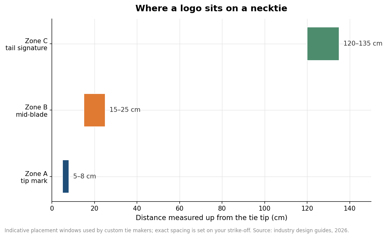
Pick the zone first because it determines how large the mark can be and whether a repeat even makes sense. A single tip mark and a full all-over pattern are two different products with different artwork, different costs, and different proofing steps.
Scale the mark to the blade, not to your screen
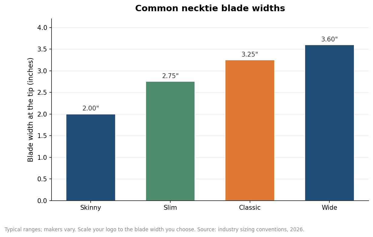
Designers almost always send a logo that is too detailed for the surface. A tie blade is narrow, and the usable width shrinks further once you account for the fold and a safe margin. Scale the mark to the blade width you have actually chosen: a skinny two-inch tie leaves far less room than a classic three-and-a-quarter-inch blade. For an all-over repeat, individual motifs that print or weave cleanly generally fall between six and twenty-five millimeters across. Smaller than that and fine detail collapses; larger and the pattern stops reading as a repeat and starts looking like a series of isolated placements. Offsetting every second row by half a tile gives a woven, traditional feel, while a straight grid reads as more geometric and modern.
Woven or printed sets your color ceiling
The construction method quietly caps how many colors you can use, so decide it while you still can. A woven (jacquard) tie builds the design out of dyed threads on the loom, which gives crisp edges and a substantial hand, but every color is a separate thread and each one adds cost and setup, so three to six colors is the practical, economical range. Woven is the right call for stripes, blocky logos, monograms, and traditional club or regimental patterns. A printed tie, usually dye-sublimated onto polyester, has no real color limit and handles gradients, photographic imagery, and fine multi-color artwork that a loom cannot. If your logo has soft shading or a dozen colors, printing is the honest choice. If it is a two- or three-color mark and you want the tie to feel weighty and formal, weave it. One detail specific to club and regimental ties: stripe direction is a convention, not an accident. British regimental stripes run from the wearer’s left shoulder down to the right, while the American reversal runs the other way, and copying an existing club tie means matching its direction exactly.
Lock color with Pantone and a strike-off
Specify color in Pantone Solid Coated values rather than describing hues or trusting an on-screen render, because thread dyeing and printing on textile both shift color away from what a monitor shows. The single most useful step you can take is ordering a strike-off, a small sample of the actual design on the actual production fabric. A well-run strike-off typically lands within one Pantone step of your target, and it is far cheaper to correct color on a sample than on a finished run. Keep your palette tight on woven ties for the reason above, and remember that a color which looks bold on coated paper can read differently against a satin or repp weave.
Send production-ready files and plan the calendar
Supply vector artwork as layered PDF, EPS, or native Illustrator with all fonts converted to outlines, which locks letterforms as shapes so they cannot reflow or substitute. If part of the art is raster, it should be at least 300 dpi at final printed size. Avoid low-resolution logos pulled from a website or exported from a slide deck; they will not hold up. On timing, Get Custom Ties sends a free digital mockup within 24 hours, a woven first order adds a strike-off for you to approve, and standard production ships in about 2 weeks after approval — faster turnaround is available with express shipping, so a corporate order tied to an event date should still start early. The minimum is 12 ties per design, in silk or microfiber.
Specify in this order, placement, scale, construction, color, then files, and each decision narrows the next cleanly instead of forcing a redo. That is the difference between a tie that looks like your brand and one that merely gestures at it.